When we think about interior design, we often think about it as a statement of ourselves, our taste, and our personality. But have you given any thought to how the colors in your environment can make you feel? Though color trends come and go, the science behind how we relate to color will stay relatively stable. When it comes to choosing interior paint colors for your Jacksonville, FL home, you should also consider how certain colors can affect your mood. After all, you want to make sure you’re spending your time in a place that leaves you feeling comfortable and at peace.
Who knew paint color could do all that? Before you grab your paintbrush and paint rollers, let’s take a look at some things to consider about interior paint from a psychological standpoint.
What kind of mood do you want in the room?
Studies have shown that every color, tone, and hue can have a certain psychological value. That’s why dentist offices are usually blue – some colors bring to mind feelings of cleanliness, calmness, and even tranquility. (And isn’t that what you’re hoping to feel when you’re at the dentist?) If you want to create color harmony in your home, you need to think carefully about the interior paint colors that you choose.
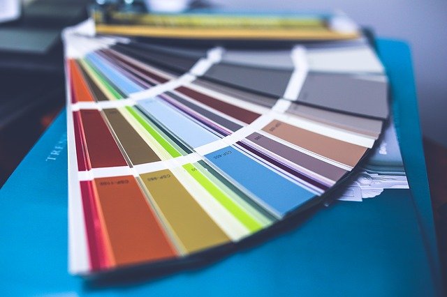
A good place to start would be interior design magazines, decorating books, and even blogs and websites like this one. Once you find a color that speaks to you – for whatever reason – you can begin thinking about how it might look and feel in your home.
Different moods for different rooms
To understand the effects of colors, you first need to understand that colors can act in a few different ways. Generally speaking, colors are either passive, active, or neutral. Dark colors can be warmer and tend to give larger rooms a more intimate feeling. On the flip side, light colors can make rooms seem larger and brighter. But let’s dig a little deeper into some specific paint color schemes and what types of feelings they have shown to be associated with.
Raise the energy level with red
Red is scientifically the most intense color, and it can really raise the energy level of a room. In living rooms and dining rooms, red can draw people together and can sometimes even stimulate conversation. Reserve red interior paint for rooms that are active, lively, and okay with a little bit of commotion.
It’s generally not advisable to choose red for the bedroom – the color red can produce adrenaline in some people, which is something that you don’t necessarily want right before you try to go to sleep.
The nuances of yellow paint
Yellow is often considered a cheery color – and it most definitely is! But yellow can have an interesting psychological effect on some people. Studies have actually shown that some people are more likely to feel angry and lose their temper if there is too much yellow in the interior – this is evident in that babies also have a tendency to cry more in yellow rooms.
Conversely, yellow can have an excellent brightening effect in halls, entries, or small spaces. To put it simply: Psychologically speaking, yellow paint is best in small amounts.
Shades of blue
You will often see blue paint colors in medical offices, hospitals, dental offices, and other places where calmness is key. This is because blue has been shown to lower blood pressure and lend itself to a calm, relaxing, and serene feeling. In the home, blue interior paint is often recommended for bathrooms and bedrooms – the places where you want to feel the most relaxed.
If you want to keep things calm but still lively, a warm blue hue might be the perfect solution for you. Warm blues like periwinkle or turquoise can strike the perfect balance.
Neutrals aren’t always neutral
Even basic colors that are generally considered neutral can affect your mood. The power of neutral paint mostly lies in its ability to play well with the stronger colors around it. If you have a primarily neutral scheme, you can add more colorful accents to liven up the atmosphere. You can also keep the whole thing neutral for a generally unobtrusive space.
When you are considering using different neutral colors, remember that some can be more powerful than others. Black, for instance, is a neutral – but it’s a very powerful neutral color that is best used for painting accents such as trims or baseboards. Your lighter neutral paint colors are more appropriate for walls and larger areas.
Consider the ceiling
Far too often, the ceiling simply gets a coat of white paint. Why is this the case when the ceiling can take up nearly 15 percent of the space in a room? Generally speaking, lighter ceilings will seem higher, and darker ceilings will seem lower. This is just the nature of optics. But lower doesn’t necessarily have to be a bad thing! If you want to evoke a cozy feeling in an otherwise large room, a darker color on the ceiling can help you achieve that.
When you are ready to paint the interior of your Jacksonville, FL home, consider all of the options available to you. You can research color trends, you can consult with your friends – but, ultimately, the best colors in your home are the ones that make you and your family the most comfortable. If you find that this painting project is taking to much of your valuable time, hire A New Leaf Painting in Jacksonville, FL. Get a free interior painting estimate today!