
Originally published in 2021. Updated for 2026 with current interior paint color trends, expanded color-selection guidance, and practical advice for Northeast Florida homeowners.
Both major paint manufacturers landed in roughly the same place for 2026, and that rarely happens.
Sherwin-Williams named Universal Khaki SW 6150 its Color of the Year — a midtone warm neutral the company describes as honoring “timeless functionality, nature-inspired warmth” and layered elegance. Benjamin Moore named Silhouette AF-655, described in its announcement as “rich espresso hues with subtle notes of charcoal.”
One is a warm khaki. The other is a deep brown. Neither is a cool gray, and neither is a statement color chosen to be noticed.
That convergence tells you more about 2026 than any individual color name. The direction is warmth, depth, and colors chosen to live with rather than to photograph.
Worth saying up front: trends are inspiration, not instruction. A color succeeds or fails based on the room it’s actually in — the natural light, the artificial light after dark, the flooring, the cabinets, the countertops, the trim, the furniture, and whatever is visible through the doorway into the next room. A color that’s genuinely trending can still be the wrong choice for your house.
What Is Changing in Interior Paint Colors for 2026?
The honest answer is that the change is gradual, not dramatic. Anyone telling you gray is dead or beige is back is selling something.
What’s actually shifting is undertone and saturation, not the categories themselves.
Neutrals aren’t going anywhere — they’re just warmer. The cool, blue-leaning grays that dominated the 2010s have been giving way to greiges, taupes and khakis with warmer undertones for several years now. Universal Khaki is the culmination of that drift, not a reversal of it.
Meanwhile, the deep end of the spectrum has become more acceptable in ordinary homes. Benjamin Moore’s choice of an espresso brown — a color that would have been considered a specialty finish a decade ago — signals that browns have moved from dated to desirable. The company tied it explicitly to a renewed interest in classic tailoring and to the broader appeal of the brown family.
The third change is application. More homeowners are carrying color onto trim, doors, ceilings and built-ins rather than confining it to walls. That’s a bigger shift than any individual color.
What hasn’t changed: rooms with good natural light forgive almost anything, rooms without it don’t, and undertones decide whether a color looks intentional or slightly off.
Warm Neutrals Continue to Evolve
Warm whites, creams, beiges, taupes, putty, mushroom and warmer greiges remain the largest category by volume, and 2026 pushes them slightly warmer still.
The appeal is practical. These colors work across open floor plans without fighting anything, they read differently at different times of day rather than looking flat, and they don’t compete with flooring or cabinetry for attention.
Where they go wrong is undertone. This is the single most common color mistake we see in Jacksonville homes, and it’s almost always the same failure: a warm neutral chosen without checking it against what’s already in the room.
Specific conflicts worth checking for:
- Flooring. A cool-toned gray LVP or tile against a warm khaki wall can make the wall read yellow. Warm oak flooring under the same color reads correctly.
- Countertops. Quartz with cool gray veining pulls warmth out of an adjacent wall. Granite with brown or gold movement supports it.
- Cabinetry. A crisp white cabinet next to a warm greige wall can make the wall look dirty. A softer, warmer white sits with it comfortably.
- Existing trim. If your trim is a cool bright white and you’re putting a warm neutral on the walls, that contrast will be visible on every baseboard and casing in the house.
The fix isn’t complicated — it’s testing the color against the permanent finishes before committing. More on that below.
Earth-Inspired Colors
Clay, terracotta, caramel, ochre, muted brown and earthy olive are all part of the 2026 conversation, and Benjamin Moore’s Color Trends 2026 palette reflects it directly — the eight-color lineup includes Southwest Pottery 048 and Sherwood Tan 1054 alongside the espresso Silhouette.
These colors carry real risk of feeling thematic if overapplied. A whole house in terracotta reads as a design statement rather than a home.
The approach that works is proportion. Use an earth tone where it has a reason to be:
- A dining room, where a warmer envelope suits how the room is used
- Built-ins or a bookcase interior, where the color frames rather than surrounds
- An office, where a grounded color reduces screen glare and reads well in artificial light
- Interior doors, which give you the color at a scale that’s easy to change later
Keep the main living areas in something quieter and let the earth tone appear where it earns its place.
Greens Inspired by Nature
Green has been in steady demand for years and shows no sign of receding. Benjamin Moore’s 2026 palette includes Narragansett Green HC-157, and Behr chose a smoky jade — Hidden Gem — as its 2026 Color of the Year.
The greens performing well are muted and complex rather than clean. Sage, olive, and deeper forest tones with gray or brown in them read as neutrals in a way a saturated green doesn’t.
Green pairs unusually well with natural wood, which matters in Northeast Florida where wood flooring, wood beams and wood-look tile are common. It also sits comfortably against warm whites, natural stone and brass or aged-bronze hardware.
Where it works: bedrooms, offices, dining rooms, built-ins, powder rooms, and increasingly on kitchen islands and cabinetry. Where it needs care: rooms with strong green reflected light from mature landscaping outside the window, which can amplify a green wall past where you intended.
Blues Are Becoming More Sophisticated
Blue hasn’t gone anywhere, but the character has changed. The clean coastal blues that defined Florida interiors for a decade have given way to muted, smoky, atmospheric blues with gray or green in them.
Benjamin Moore’s 2026 palette includes Raindance 1572 and Batik AF-610, both in this quieter register. Deep navy also remains durable — it has functioned as a near-neutral in American interiors for long enough that it no longer reads as a trend.
One local caution. Blues can go cold quickly in a north-facing room, and Jacksonville homes with heavy tree canopy get less direct light than their window size suggests. A blue that looks calm in a bright showroom can look gray and flat in a shaded family room. Test it in the actual room before committing.
Rich and Moody Interior Colors
Deep colors — burgundy, plum, espresso, charcoal, forest green, dark blue — have moved firmly into the mainstream. Benjamin Moore choosing a brown as deep as Silhouette for its Color of the Year is the clearest evidence of that.
These work best in rooms where enclosure is an asset rather than a problem:
- Powder rooms — small, used briefly, and the one place a dramatic color has no downside
- Dining rooms — used mostly in the evening under artificial light, which deep colors flatter
- Offices and libraries — where a darker envelope reduces glare and helps focus
- Bedrooms — if you want restful rather than bright
- Built-ins and millwork — depth at a scale that doesn’t commit the whole room
Three practical factors decide whether a deep color succeeds:
Light. A dark color reflects very little of what’s available. In a room that’s already dim, it will read almost black after sunset. That’s fine if it’s intentional and you’ve planned the lighting; it’s a problem if you expected the color you saw on the chip. Our guide on Light Reflectance Value covers how to predict this before you buy.
Sheen. Deep colors show sheen more obviously than pale ones, and higher sheen on a dark wall produces visible glare and highlights every surface imperfection. Flat and matte finishes generally serve deep colors better — more on that in our sheen comparison.
Surface condition. Dark colors are less forgiving of wall imperfections than light ones. If the drywall has patches, nail pops or texture inconsistencies, they’ll be more visible under a deep color than under a warm white.
Are White Walls Still Popular in 2026?
Yes — but the whites being chosen have shifted.
The crisp, cool, almost blue-white that paired with gray walls has lost ground to softer whites with warmer undertones. Benjamin Moore’s 2026 palette includes Swiss Coffee OC-45, a warm white, as the counterweight to the deeper colors in the collection. Sherwin-Williams pairs Universal Khaki with Neutral Ground and similar soft neutrals rather than a stark white.
White remains genuinely useful, and not just as a default. It’s the right answer for ceilings in most rooms, for trim in most homes, for spaces that need to feel larger, and for homes where the architecture or the furnishings are doing the visual work.
The trap is undertone. Whites carry undertones just as strongly as any other color, and they show more, not less. A white with a yellow undertone next to a white with a blue undertone will look obviously wrong in the same sightline.
If you’re keeping existing trim and painting the walls, the wall white has to work with the trim white you already have. That relationship gets checked before the color gets ordered, not after. Our guide to choosing a white trim color goes deeper on this.
Color Drenching and Using More Color
Color drenching — carrying one color across walls, trim, doors, and sometimes the ceiling — has moved from designer technique to something homeowners actually request.
The reason it works is that it removes the visual breaks. Without the contrast line at every baseboard and casing, the eye stops registering the room’s edges and the space reads as larger and more enveloping. It’s counterintuitive, and it’s why drenching a small dark room often works better than painting it white.
Two versions of it are current: a single color throughout, or coordinated tonal variation — the same color at different depths on walls versus trim versus ceiling.
Where to be careful:
- Open floor plans. Drenching one area of a continuous space creates a hard boundary where the architecture doesn’t have one. It works best in rooms that close.
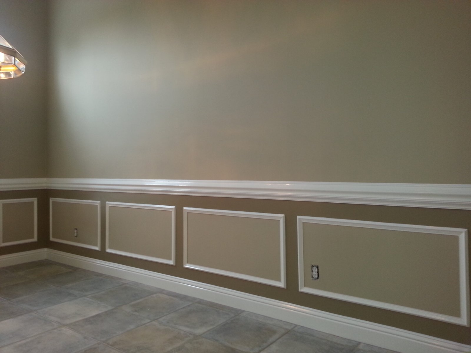
- Homes with substantial millwork. If you have crown, casings and wainscoting worth looking at, drenching hides them. Sometimes that’s the point; often it isn’t.
- Preparation demands. Drenching means painting trim and doors, which is significantly more labor than walls alone and requires different products and preparation.
It’s also worth knowing that drenching a room is harder to undo than repainting walls. Trim that’s been taken to a deep color takes real work to bring back to white.
Are Accent Walls Still Relevant in 2026?
They haven’t disappeared. They’ve become more specific.
The version that has fallen out of favor is the arbitrary accent wall — one wall painted a bolder color for no architectural reason. What’s replaced it is color applied where the room already has a focal point.
More current alternatives:
- A fireplace or built-in wall — the architecture justifies the color
- Built-in interiors — color inside a bookcase, neutral outside
- The ceiling — the most underused surface in most homes
- Interior doors — low commitment, high visual return
- An entire small room — rather than one wall of a large one
- Coordinated trim — deeper trim against lighter walls, reversing the usual relationship
The principle: color should have a reason to be where it is.
How Northeast Florida Light Changes Interior Paint Colors
This is where a national trend article stops being useful, because the same color genuinely behaves differently here than it does in a magazine photographed in Connecticut.
Northeast Florida daylight is strong and it stays strong for most of the year. That intensity amplifies undertones. A warm neutral that reads as a soft greige in a showroom can push distinctly yellow on a south-facing wall at two in the afternoon. A cool white can look sterile. Saturated colors read more saturated than the chip suggested.
Directional exposure matters, though local conditions can override it:
- North-facing rooms get consistent indirect light that tends to run cooler. Warm colors can flatten here, and cool colors can go cold. This is where warmer undertones usually help.
- South-facing rooms get the most sustained direct light. Colors read brighter and warmer, and a high-reflectance white can approach glare.
- East-facing rooms get warm morning light, then indirect light for the rest of the day. The same wall genuinely looks different at 8am and 4pm.
- West-facing rooms reverse it, with strong warm light arriving late in the afternoon that can push a neutral several steps warmer.
Two features specific to homes here complicate all of that. Covered lanais and deep porches shade the rooms behind them, so a living area with a wall of glass may get far less direct light than the window size implies. And mature oak canopy can shade one elevation of a home completely while the other side sits in full sun — and green light filtering through leaves affects how wall colors read.
Then there’s what happens after sunset. Most homeowners choose colors during the day and then live with them at night under artificial light. A warm LED at 2700K and a cool one at 4000K will make the same wall look like two different colors.
More on this in our guides to how lighting affects color at home and choosing colors for poorly lit rooms.
How to Choose a 2026 Paint Color Without Regretting It in 2027
Trend colors become dated when they’re chosen instead of considering the room rather than in addition to it.
The sequence that avoids regret:
1. Start with what isn’t changing
Flooring, countertops, cabinets, tile, stone, permanent trim. These have longer lifespans than paint and cost far more to change. The wall color works around them, not the reverse.
2. Narrow by undertone, not by name
Decide whether the room needs a warm or cool direction based on those fixed finishes, then look at colors within it.
3. Get large samples into the actual room
A two-inch chip cannot show you how a color behaves across twelve feet of wall. Color intensifies with scale, and whatever undertone is present gets multiplied by the area.
4. Look at them at four times of day
Morning, midday, late afternoon, and after dark under your own lighting. Move the sample to different walls — the wall opposite the window behaves differently from the one beside it.
5. Check it against the next room
In an open floor plan, you never see one color alone. Hold the sample where the two spaces meet.
Fifteen minutes of this prevents most color regret, and it’s the step homeowners skip most often.
Where to Experiment With Trend Colors
Not every room carries the same risk. Some spaces are natural places to try something current.
Lower risk: powder rooms, home offices, guest bedrooms, dining rooms, laundry rooms, interior doors, built-ins, and ceilings. These are small, self-contained, or easy to change. A powder room is the single best place in any house to try a color you’re not sure about.
Higher risk: the main living area of an open floor plan, primary bedrooms, and anything visible from multiple rooms at once. These are large, expensive to repaint, and set the tone for everything around them.
A reasonable structure: quieter neutrals through the connected main spaces, stronger color in the rooms that close. That gives you current without committing the whole house to a moment in time.
2026 Trends vs. Timeless Color Choices
Neither approach is better. They serve different purposes, and most successful interiors use both.
| Trend-Driven | Longer-Term | |
|---|---|---|
| Typical colors | Deep browns, clay, saturated greens, moody blues | Warm whites, soft greiges, muted sage, navy |
| Best applied to | Small or closed rooms, built-ins, doors, ceilings | Main living areas, hallways, open plans |
| Repaint horizon | Shorter — and that’s fine | Longer, often a decade or more |
| Resale consideration | More polarizing to buyers | Broadly acceptable |
| Cost to reverse | Higher if trim and doors are involved | Lower |
Two combinations that consistently work: timeless main areas with stronger color in secondary spaces, or neutral walls with more adventurous cabinetry, built-ins and doors. Both give you the current look without betting the whole interior on it.
Frequently Asked Questions About 2026 Interior Paint Colors
What interior paint colors are popular in 2026?
Warm neutrals and earthy tones lead. Sherwin-Williams named Universal Khaki SW 6150 its Color of the Year, and Benjamin Moore named Silhouette AF-655, a deep espresso brown. Muted greens, atmospheric blues and rich browns are all prominent.
Are gray walls out of style in 2026?
Cool blue-gray has lost momentum, but gray hasn’t disappeared. Warmer greiges with brown or taupe undertones remain widely used. If your home has cool gray walls, they read as dated only when everything else in the room is warm.
Are white walls still popular in 2026?
Yes, though warmer whites have replaced the crisp cool whites of the gray era. White remains the standard for ceilings and most trim, and it’s still the right choice for rooms that need to feel larger or brighter.
What neutral colors are replacing cool gray?
Warm greiges, taupes, khakis, putty and mushroom tones. The shift is toward neutrals with yellow, red or brown undertones rather than blue ones.
What paint colors make a room feel warmer?
Colors with yellow, red or brown undertones — warm whites, creams, khakis, terracotta and browns. Deeper colors also make a room feel more enclosed, which reads as warmth even when the hue is cool.
Should every room in a house use the same color palette?
Not the same color, but a coordinated palette helps — particularly in open floor plans where multiple rooms are visible at once. Rooms that close can vary more freely.
How can I tell whether a paint color will work with my home’s lighting?
Put a large sample in the actual room and look at it in the morning, at midday, in the late afternoon, and after dark under your own lights. Check it on more than one wall, and against your flooring and trim. A store chip under showroom lighting won’t tell you.
Planning an Interior Repaint?
Color is the decision homeowners spend the most time on and the one that has the least to do with whether the finished result holds up.
What determines that is everything around it: surface preparation, drywall repairs where they’re needed, appropriate priming, protection of floors and furnishings, the sheen selected for each surface, the quality of the coating, and the care taken cutting in against trim that isn’t being painted.
A perfect color applied over an unprepared wall still looks like an unprepared wall.
A New Leaf Painting Contractors has been painting interiors across Jacksonville and Northeast Florida since 2001. If you’re planning a repaint, our interior painting services page covers how we prepare, protect and finish a home, and our interior painting cost guide explains what drives project pricing.
Related Color & Interior Painting Guides
- How to Determine a Paint Color’s Light Reflectance Value — predicting how light or deep a color will read before you buy it.
- Home Color and Lighting — how natural and artificial light change the way a color appears.
- Choosing Colors for Dark or Poorly Lit Rooms — what actually helps when a room is short on light.
- Flat vs. Matte vs. Eggshell — how sheen changes the appearance of a color on the wall.
- Interior Painting by Room — how each room in a home gets approached differently.
- Best Interior Paint for Florida Homes — which products hold up in Northeast Florida conditions.
A New Leaf Painting Contractors
Serving Jacksonville and Northeast Florida since 2001. Call or text 904-615-6599.