

How to Choose Interior Paint Colors for Your Home
Thomas Drake is the founder and owner of A New Leaf Painting Contractors in Jacksonville, Florida. He and his crews have been painting homes across Northeast Florida since 2001, and what follows is how he actually talks homeowners through picking a color.
Revised September 1, 2026
The question I get more than any other, on just about every interior estimate, is some version of: what are people painting their houses right now?
I understand why people ask. You’re about to spend real money on something you’ll look at every day, and knowing what other people picked feels like a safety net. But I’ve never had a good answer to that question, and after twenty-five years of doing this I’ve stopped pretending I do.
When we’re helping homeowners with interior painting in Jacksonville, FL, one of the biggest things we try to explain is that color does not live by itself. The room, the light, the floors, the cabinets and even the bulbs can change how that same color reads once it is on the wall.
Here’s the honest version. I’ve watched the same color go on two houses in the same week and look like two different colors. Not slightly different — different. One room reads soft and warm, the other reads grey and cold. Nothing changed but the house: the windows faced a different direction, the floors were a different species of wood, the light bulbs were a different temperature. Same gallon. Same painter. Different result.
So what follows isn’t a list of colors. It’s how I think about the decision when a homeowner asks me to help with it.
Start With the People Who Actually Live There
Outside of a house, I’d tell you to be careful. Exterior colors have neighbors, HOAs, resale, and forty years of sun to answer to. Inside is different. Inside is yours.
Think About How the Room Gets Used
Before I talk color with anyone, I want to know what actually happens in the room. Not what it’s called on the floor plan — what happens in it.
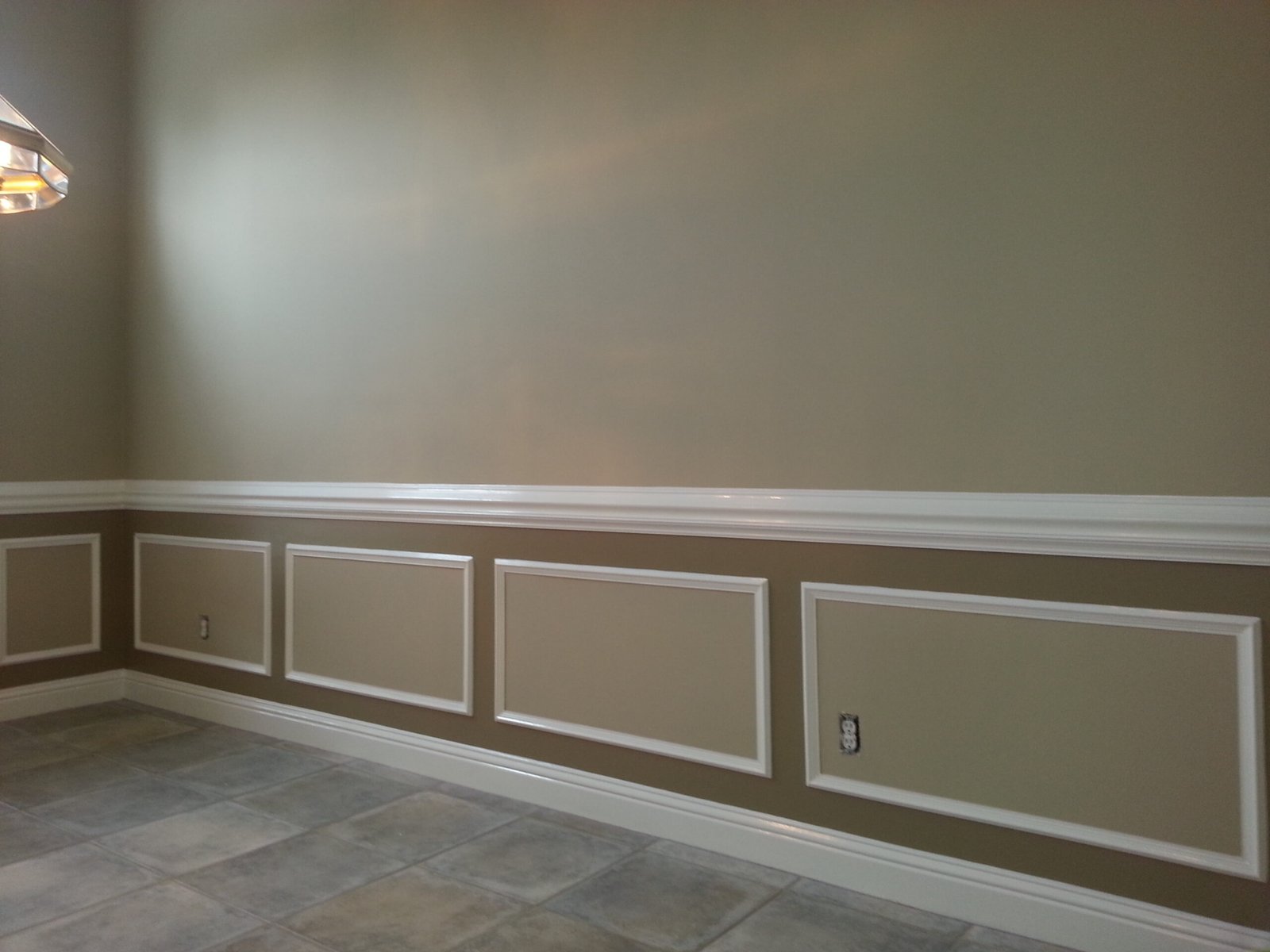
A home office someone sits in for eight hours a day wants a different treatment than a guest room that gets opened twice a year. Bedrooms usually want to feel settled. Family rooms take the most abuse and want a color and a finish you can wipe. Entries set the tone for everything past them, and they’re small enough that you can do something more interesting without committing the whole house. Dining rooms are one of the few places a deeper color still gets used well, because you’re mostly in there at night with the lights low, which is exactly when a deep color looks best.
Kitchens are their own conversation, because the cabinets and counters are already deciding most of it for you.
Use drives the sheen as much as the color, and people forget that half. A flat color and a satin version of that same color don’t look like the same color on a wall. If you’re weighing that, the sheen guide covers where each one belongs.
Light Changes Paint More Than People Expect
If you take one thing from this, take this one. Light does more to a color than almost anything else, and it’s the part homeowners consistently underestimate.
South-facing rooms here get bright, warm light most of the day, and that light pushes colors warmer than the chip suggests. A beige that looked balanced in the store can go distinctly yellow on a south wall by two in the afternoon. North-facing rooms run the other way — cooler, flatter, more even — and they’ll pull the warmth out of a color and leave it looking greyer than you wanted. We get enough sun in this part of Florida that even a north room is usually bright, it’s just bright in a different temperature.
Then there’s what happens after dark, which is when most people are actually home. Your bulbs are doing as much work as your windows. A 2700K bulb warms everything up. A 5000K bulb strips that warmth right back out and can make a soft white look almost blue. I’ve had people love a color at four in the afternoon and call me at eight that night unsure about it, and nothing was wrong — the sun went down and the lamps took over.
Room size and ceiling height matter too. The same color over two hundred square feet of wall is more color than that same color on a two-inch chip. Whatever you saw on the card, the wall version will be more of it.
A few things that make sampling actually useful:
- Sample in the room itself, not the garage, not a store, not your phone screen
- Put it on two different walls — one wall’s light isn’t the room’s light
- Look at it in the morning, in the afternoon, and at night with the lamps on
- Don’t paint the patch right up against white trim or a primer spot; the contrast will lie to you
- Make the patch bigger than feels necessary. A small square surrounded by the old color reads wrong every time
If you want to get more technical about why some colors bounce light around a room and others swallow it, light reflectance value is the number that explains it.
Whites Are Harder Than They Look
People say “we’re just going to do white” like it’s the simple option. It’s usually the one that takes the most thought.
Every white has an undertone. Some lean warm — creamy, a little yellow, a little pink. Some lean cool — grey, blue, almost violet. On the card you can barely see it. On four walls next to your floors and your cabinets, it’s obvious. A cool white next to warm oak floors can make the floors look orange. A warm white next to crisp modern cabinets can look dingy. The white didn’t change; what’s around it did.
So the fixed finishes pick the direction. Your flooring, your countertops, your tile, your cabinets — those aren’t changing this week. Paint is the flexible one. It should serve them.
And here’s the part that surprises people on estimates: light colors are often harder to cover than dark ones. That runs against intuition, but it’s how paint works. Lighter colors carry less pigment and hide less. Going from a deep or saturated wall — a strong red, a dark brown, a heavy gold — to a white or off-white, that old color pushes back through.
What that means practically:
- Some of those walls need a primer coat first, and a tinted primer does more work than a plain white one
- A big color swing is often primer plus two finish coats, not two coats total
- Depending on the old color and the product, a third finish coat is sometimes what it takes to get it even
I’m not telling you this to talk you out of white or to pad an estimate. I’m telling you because a homeowner deciding between a mid-tone and a bright white over a dark room should know that choice affects the labor and the material, and that’s worth knowing while you’re still deciding rather than after. If a bid for that job looks suspiciously low, it’s usually because someone priced two coats and is hoping.
One more thing people don’t think about until it’s on the wall: if the walls change and the trim doesn’t, the trim can suddenly look wrong. Builder trim that looked fine against beige can read yellow and tired next to a fresh clean white. Decide walls, trim and ceiling together, not one at a time.
The Change We See Most Often Around Here
There’s one job that comes across my desk more than any other, and if you live in a house built or decorated in the late nineties or early two-thousands you’ll recognize it immediately.
Darker beige walls. Golden yellow in the living areas. Heavy warm trim. Furnishings that were chosen to match all of it. None of it is bad work — it’s just of a moment, and that moment was twenty-odd years ago. The homeowner usually describes what they want the same way: cleaner and brighter, but not cold. They’ve seen white rooms in photos and they’re a little afraid of ending up in a dental office.
The move that tends to work is a soft, timeless warm white on the walls — Sherwin-Williams Alabaster is one that comes up often, though it is one option among many rather than an answer — with warmer neutrals carried through and clean trim to give it edges.
What happens is more dramatic than the color swatch suggests. Rooms feel bigger, because lighter walls bounce light instead of absorbing it. The natural light you already had suddenly does more work. And the things you weren’t planning to change start looking different — wood floors that read orange against gold often read rich and warm against a soft white; cabinets that looked dated against beige can look intentional. Nothing was replaced. The backdrop changed.
That transformation works when it fits the house and the people in it. It isn’t the right answer everywhere. I’ve walked houses where a warm white would have flattened everything interesting about them. But if the description above sounds like your living room, it’s worth sampling.
Popular Doesn’t Mean Right for Your House
Back to the question I started with.
Popular colors are genuinely useful as a starting point. They’re popular because they’re forgiving, they photograph well, and they work in a lot of houses. That’s not nothing. But popularity is a statement about a lot of houses in general, and you’re painting one house in particular.
Your windows face where they face. Your floors are what they are. Your ceiling is eight feet or it’s eighteen. You have a room you use constantly and one you barely enter. None of that was factored into a color of the year, and all of it matters more than the list did.
Use the popular ones to start. Don’t let them finish.
How We Help People Narrow It Down
When somebody’s stuck, this is the order I work in.
Start with what isn’t changing. Floors, counters, tile, cabinets, stone, any fixed metal finishes. Those set the temperature of the room before you open a fan deck.
Then pick a direction, not a color. Warm or cool. Light or mid-tone. That one decision eliminates most of the deck and makes everything after it easier.
Get down to two or three real candidates. Not twelve. Twelve options doesn’t produce a better decision, it produces paralysis, and I’ve watched it stall projects for months.
Sample properly and live with it a couple of days. Morning, afternoon, and after dark with your own lamps on. This is the step people skip and the one that prevents the expensive mistake.
Settle trim and ceiling in the same conversation. They’re part of the color, not an afterthought.
We’ll walk through this with you as part of the estimate, and if you want more structured help there’s our color consultation. If you’re in a newer home and wondering whether the builder’s paint is worth keeping at all, that’s a different question with a different answer — we cover it in builder-grade paint vs. premium paint. And if you’d rather see how this plays out on a finished job than read about it, there’s a walls-only interior repaint we documented in Queen’s Harbour.
One Last Thing
Choosing a color shouldn’t feel like a test you can fail. Nobody’s grading it. The goal isn’t to land on the color everyone else is using this year — it’s to find one that works with your house, your light, and the way you want the room to feel when you walk into it.
And if you get it wrong, it’s paint. We can change it.
If you’d like help thinking it through, or you’ve settled on a color and want the walls prepped and painted properly, we’re here. More on how we approach the work is on our interior painting page, and there’s a deeper library of guides in the interior painting resource center.
Want a second opinion before you commit?
We’ll look at your rooms, your light and your finishes, and give you a straight answer — including when the answer is that what you’ve got is fine. Free estimate, no pressure.